Exibit a: Home screen with rss feeds on normal theme:

Exibit b: Same image with font size reduced to 11 px:
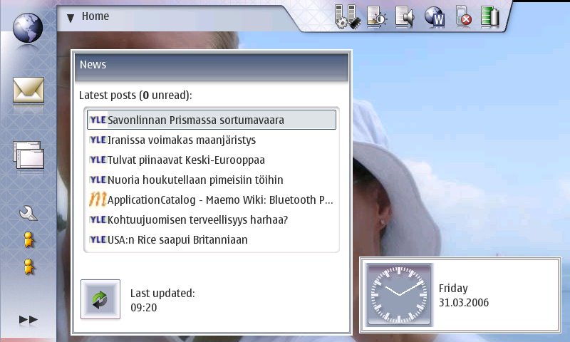
See how in the 11 px version you can now see all the headlines of the news applet almost completely. Also, as there is more space between the lines, the applet doesn't look so stuffed. To improve the applet even more, it could be changed so that the refresh button would be on the heading part of the applet, on the top right corner. Also, the 0 unread could be on the heading part besides the news -text. This way news applet would be just as functional, but not take so much space on the home view, as the bottom part could be freed. Or alternatively there could be more posts displayed on the applet. Ok, same applies to the clock applet. With smaller font size, the text could be put under the clock. Thus the horizontal size of the applet would be smaller. Also, what's up with the clock border. It looks like there are two borders around the clock applet.
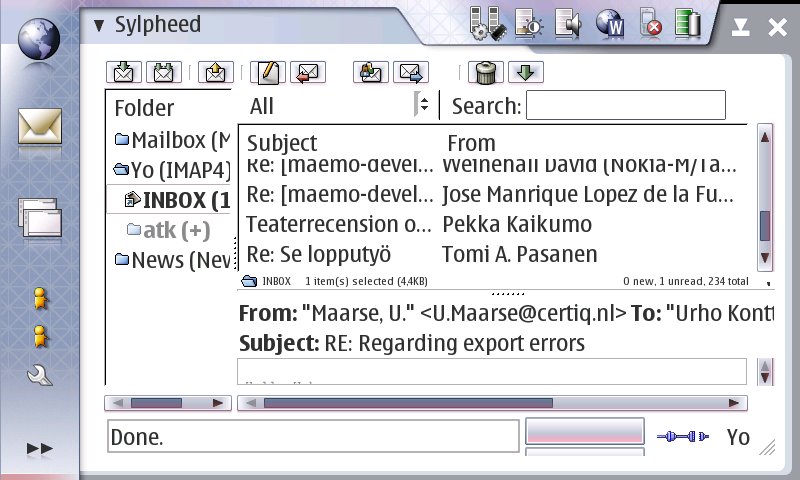
But that is not the worst part. When for example using sylpheed, a more complex app, the situation is much worse, although much of this is due to current conversion needing to set the statusbar off by default as well as the search bar. By turning them off by default, the app would be much better on both font sizes, but even then it would be better with 11px main font size. Also, another problem is that it is impossible in the gtkrc to set the app view size / the margins on the left and right of the app. There is maybe 24 pixels in the left and maybe 16 on the right. And some space at the top and bottom. This is completely waste of space as the apps would look just as good without the unneccesarily wide borders - AND they would have slightly more space (maybe 5-7% more... don't laugh, it's really quite a lot.)
Original:
And then the version with 11px fonts:

See how much more is visible and the font is not by any means small or too small. The app is far more usable after that small adjustment to font size. And the same thing applies to all apps really.
Also the main menu would greatly benefit from reduced font size. At the current setting, once you have even one xtra app, the first level menu becomes scrolling. Not good. See:

But, once again, after 11 px font, the menu doesn't suffer from this anymore:

Oh, and click on any of the images to see how it looks in full size.
Here is the modified gtkrc.
Ok, here's a simple how-to:
download the theme zip from: http://www.helsinki.fi/~konttori/Me.../theme_test.zip
Connect your 770 to your comp. Unzip the file to the root of your mmc.
Disconnect 770. Open xterm (you must be in rd mode or otherwise have root access).
Execute following commands:
sudo gainroot
cp -R /media/mmc1/theme_test /usr/share/themes/theme_test
Ok. Theme is now installed. Close xterm. Open Control panel and go to personalization. Choose the new theme, cleverly titled: Urhon testiteema (which incidentally stands for Urhos test theme in finnish).
You're done.