Exibit a: Home screen with rss feeds on normal theme:

Exibit b: Same image with font size reduced to 11 px:
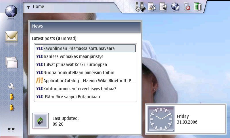
See how in the 11 px version you can now see all the headlines of the news applet almost completely. Also, as there is more space between the lines, the applet doesn't look so stuffed. To improve the applet even more, it could be changed so that the refresh button would be on the heading part of the applet, on the top right corner. Also, the 0 unread could be on the heading part besides the news -text. This way news applet would be just as functional, but not take so much space on the home view, as the bottom part could be freed. Or alternatively there could be more posts displayed on the applet. Ok, same applies to the clock applet. With smaller font size, the text could be put under the clock. Thus the horizontal size of the applet would be smaller. Also, what's up with the clock border. It looks like there are two borders around the clock applet.
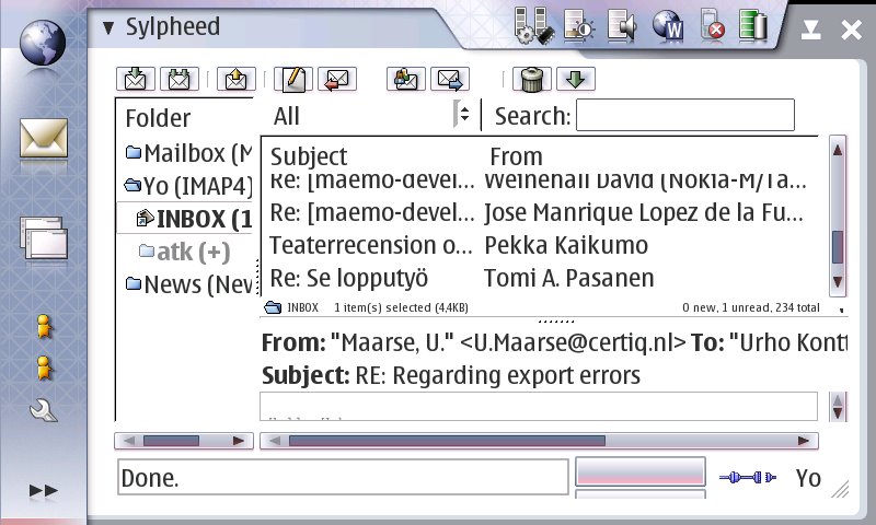
But that is not the worst part. When for example using sylpheed, a more complex app, the situation is much worse, although much of this is due to current conversion needing to set the statusbar off by default as well as the search bar. By turning them off by default, the app would be much better on both font sizes, but even then it would be better with 11px main font size. Also, another problem is that it is impossible in the gtkrc to set the app view size / the margins on the left and right of the app. There is maybe 24 pixels in the left and maybe 16 on the right. And some space at the top and bottom. This is completely waste of space as the apps would look just as good without the unneccesarily wide borders - AND they would have slightly more space (maybe 5-7% more... don't laugh, it's really quite a lot.)
Original:
And then the version with 11px fonts:

See how much more is visible and the font is not by any means small or too small. The app is far more usable after that small adjustment to font size. And the same thing applies to all apps really.
Also the main menu would greatly benefit from reduced font size. At the current setting, once you have even one xtra app, the first level menu becomes scrolling. Not good. See:

But, once again, after 11 px font, the menu doesn't suffer from this anymore:

Oh, and click on any of the images to see how it looks in full size.
Here is the modified gtkrc.
Ok, here's a simple how-to:
download the theme zip from: http://www.helsinki.fi/~konttori/Me.../theme_test.zip
Connect your 770 to your comp. Unzip the file to the root of your mmc.
Disconnect 770. Open xterm (you must be in rd mode or otherwise have root access).
Execute following commands:
sudo gainroot
cp -R /media/mmc1/theme_test /usr/share/themes/theme_test
Ok. Theme is now installed. Close xterm. Open Control panel and go to personalization. Choose the new theme, cleverly titled: Urhon testiteema (which incidentally stands for Urhos test theme in finnish).
You're done.
i followed your instructions, however the statusbar moved up to the top left, and the theme with the modified font size seemed to have lost it's "hildonization". i believe i was using the theme2 as i was modifying it, so perhaps that caused a problem, or i may have messed up when copying you new gtkrc file. the new font size did work, but everything used little grey boxess rather than the skin of the theme. it was all still functional, just very ugly. any ideas what i might have done wrong? i will try again and let you know how it goes.
ReplyDeleteJay H
alright, well i messed around with it some more and it apperas that deleting gtkrc.cache loses all the links to the images, etc. what is the purpoe of deleting the cache, and did i misunderstand you to mean gtkrc.cache?
ReplyDeleteok, so it seems that you must remove the gtk cache file, but if I do the formatting is messed up, as well as the images for the skin do not appear. can you provide a copy of the cache file that worked for you? i assumed the system would write a new file when it found no cache in that themes folder, but mine isn't doing it. btw, i made the necessary changes as root, might that be my problem?
ReplyDeleteI updated the theme installation instructions to have an easier way of installing the changes. Sorry about the previous one.
ReplyDeleteIt looks like a good improvement. But people with bad sight will not like, that is why probably Nokia left it with big-fonts... Of course, they could've included a "small-fonts" theme so people could choose it.
ReplyDeleteThis comment has been removed by a blog administrator.
ReplyDeleteThis comment has been removed by a blog administrator.
ReplyDeleteHi!
ReplyDeleteYour post is really useful as I was wondering whether it was possible to reduce fonts size or not!
I've applied Andys_theme.zip (the link to theme_test.zip is broken): happy to be able to read more than a few words on the same screen now!
The only thing that I dislike is the fact that the title for menus (ie "Home" on home page) is placed a bit too high in the status bar: any chance to put it a little bit lower so that it is well vertically aligned with the arrow?
...not sure I'm really clear in my request: let me know if not, sorry for my poor English ;-)
You have excellent english. And it is a good point about the title location. I will try to see what can be done about that.
ReplyDelete