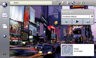
So, I dared to test making a theme yesterday. Many bugs were found from theme maker during this process and many reasons, why I have to add new tiles were also discovered. Thus, unfortunately, the tileset image will become even bigger for the next releases.
So, I made a theme that I call itunes theme. Have a look:

As I don't really have the time to really invest in a great theme, I just decided that I will make a theme based on existing ideas and just test that such a theme *can* be done for maemo as well.
Ok, so, home applets work pretty well, although for example the clock applet doesn't follow the normal home view theme. Now, why is that? Probably it was decided that it would take too much space that way. But Nokia, please! You could have added some themability for it anyway. It looks pretty dull at the moment. Perhaps someone could make a themable version of the clock (along with interface to GPE calendar perhaps).
Also, as can be seen on the music player, arrow down has presed white border, which looks pretty dull in the applet. I'm going to try to do something about that in the future.
Also, some little errors remain in that image, such as the top right corner application border, which I fixed as soon as I saw it, but didn't bother to transfer the changes to 770.
I'll include the source image for this theme for anyone interested for the next theme maker version, which I'll try to launch today.
Also, for anyone interested in just testing it out, here is the theme: itunestheme.zip
Install as usual. Copy to mmc, open xterm, sudo gainroot, cd /media/mmc1/itunesTheme, sh ./install.sh, use control panel to switch.
As a final note, I can now say, that theme maker can be used to make some really sweet themes for 770 and it really doesn't take long to make some.
To me, this already looks more modern than the standard theme. Well done.
ReplyDeleteGood to hear that. It was a nice way to test out the theme maker. But at the same time, it revealed that more changes are needed for the theme maker, such as for the arrows. Also, more tests are needed, eg. do the home applets support different scales of transparency. It would be nice ot be able to make for example glass like themes. Naturally normal windows do not support this, but it would rock if home applets would.
ReplyDelete